
Shopify is one of the world’s most well known softwares, and is often the go-to solution for anyone looking to move into the online retail space. Shopifys’ website is designed to guide visitors into becoming devoted users.
Dissecting their approach to User Experience (UX) and User Interface (UI) offers a masterclass in digital quality.
1. The Significance of Analysing Shopifys’ Strategy
For us here at Strafe, learning more about Shopifys’ digital strategy is more than an academic exercise, it allows us look at the ‘why’ and ‘how’ behind Shopifys’ actions, giving us the tools to potentially redefine our digital presence.
2. Clarifying UX vs. UI
Exploring Shopifys’ website and understanding the distinction between UX and UI is crucial. UX is the journey’s blueprint, ensuring that navigation through a website is intuitive, engaging, and frictionless. On the other hand, UI focuses on the visual and interactive elements such as colours, typography, and buttons that make using a website simple but visually engaging.
3. Decoding Shopifys’ Master Plan
We found from the get-go, Shopify’s homepage shows a great example of a UX and UI collaboration. A video background highlights the variety and success of businesses powered by Shopify, spotlighting the user’s potential journey. This strategy emphasises Shopify’s commitment to showcasing real success stories, encouraging a connection with prospective users.
High-contrast CTAs are strategically positioned, acting not just as navigational tools but as clear invitations to begin the Shopify experience. These elements are carefully designed to reduce user hesitation and drive them towards action.

4. Addressing Visitor Concerns
It is important to recognise that conversion isn’t always immediate. Shopify’s website contains trust-building elements early in the user journey, highlighting the scale, brand logos and testimonials are not simply decorations but instead powerful endorsements of Shopifys’ platform, designed to ease doubts and build credibility with potential users.
Shopifys’ site excels in audience segmentation, offering tailored pathways for large enterprises, partners, developers or creators. This clear approach makes sure that every visitor is able to relate and find a relevant entry point into the Shopify space.
Addressing common objections and questions is another great example Shopify shows that we can learn from. The platform outlines its ease of use, integration capabilities, and branding flexibility, directly addressing potential user concerns. This proactive strategy minimises doubts and allows for a smoother conversion process.

5. Turning Sceptics into Advocates
We found that Shopify does a great job of demonstrating the simplicity and efficiency of its platform, through a balanced mix of informative content and high quality visual elements, ensuring that its message is clear and captivating. The way it is designed cleverly avoids overwhelming visitors with text and instead using an intuitive presentation of its features and benefits.
At Strafe, we recognise the importance CTA’s have on the user’s journey. Shopifys’ calls-to-action are extremely strong helping to boost those conversions. Positioned after a thorough showcase of features, benefits, and reassurances, these CTAs are the final nudge to convert curiosity into commitment.

6. Key Takeaways from Shopify’s Approach
Shopifys’ website is not only a portal to its services but an expertly created journey designed to guide visitors from ‘just taking a look’ into converting customers. The platform showcases its features whilst building a narrative that addresses user needs, concerns, and aspirations throughout.
For businesses and designers, Shopify offers strong insights into creating digital experiences that captivate its audience, leading to conversions. It demonstrates the power of combining strategic UX with compelling UI to attract users, whilst also creating long-term loyalty.
The UX/UI strategy Shopify uses exemplifies how individual design elements, when integrated harmoniously can create a compelling story, guiding the user through a seamless digital journey. It cements Shopify’s position as a leader in the e-commerce space.

7. Expanding the Analysis
Diving deeper into Shopify’s site reveals more detail of its UX/UI in action, such as using gradient overlays on videos to ensure text readability, a subtle but critical element that maintains user engagement without sacrificing visual appeal. Micro-content next to CTAs offers value propositions, attracting users with offers like discounted plans right from the outset.
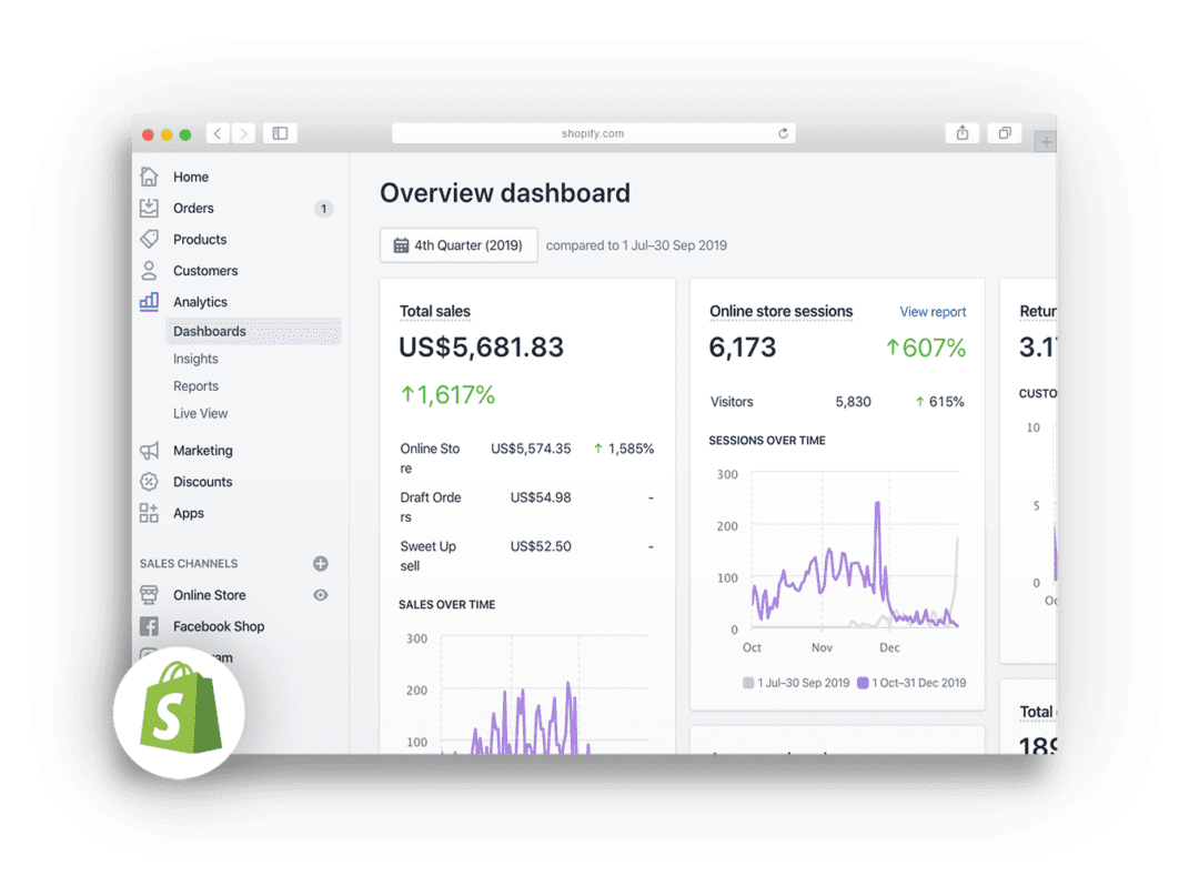
Shopify also addresses backend concerns, showing the user the platform’s operational efficiency. By dedicating sections to backend management, Shopify reassures users about the ease of managing their online store, covering every step from order fulfilment to inventory management.
The strategic placement of videos throughout the site adds another level of engagement, allowing users to visualise the Shopify experience through the eyes of successful entrepreneurs. These stories provide testimonials as an immersive experience that highlight the transformative potential of Shopify to its users.
Here at Strafe, mitigating potential customer concerns early on is important to us. Shopifys’ commitment to addressing their user concerns, such as tackling potential objections around payment gateways, point of sale systems, and marketing tools is done using visual cues and concise explanations. Shopify clears up these complex aspects, making them accessible to users regardless of their technical proficiency.

8. Concluding Thoughts
For us, Shopifys’ website isn’t a showcase of what it offers, it’s a carefully thought through journey that reflects insights into user behaviour and preferences. By meticulously combining intuitive UX with engaging UI, Shopify creates a digital experience that draws visitors in, creating confidence in their choice to engage with the platform.
This UX/UI strategy offers a blueprint for creating digital experiences that resonate with its users. It highlights that addressing user needs throughout the journey is key to converting visitors into loyal customers.
It’s clear that the platform’s success is the result of user focused design choices that put clarity, engagement, and trust at the forefront. Shopifys’ approach offers invaluable lessons in creating experiences that meet user expectations, setting a new standard for digital excellence in the e-commerce industry.