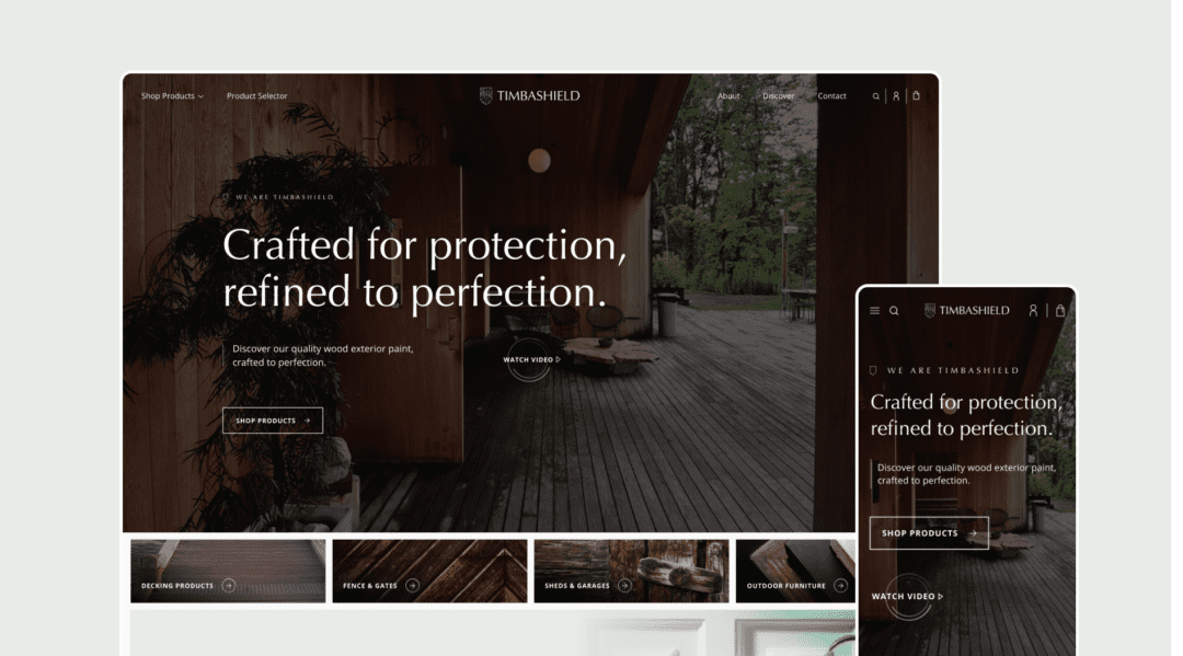
The homepage of an ecommerce website has to perform so many things; it welcomes, guides, informs, and converts visitors. As the digital face of your brand, its effectiveness can be the difference between a browsing user and a purchasing customer. So let’s run through the key elements that make up an epic ecommerce homepage!
1. The 3 ways to navigate
For us here at Strafe we ensure our sites cater for all types of users when its comes to navigation. Users generally fall into 1 of 3 categories. For us this is super important, so we’ll detail these for you.
First, there’s the most traditional method where the users rely on dropdown menus and the main navigation bar to find their way around. (Aware this seems obvious, but bear with us!) This approach demands a well-organised and intuitive menu structure that can accommodate the vast number of products and categories within your eCommerce website. The second method involves users scrolling through the homepage, making decisions based on what catches their eye. This scrolling behaviour underscores the importance of strategic content placement and the concept of ‘signposting’ to guide users toward key areas or products of interest. In layman’s terms, what is most important to the user and to yourself as a company? Should we push the best sellers first, or the categories we have? Only you will know what’s best.
Lastly, there’s search-led navigation, where users prefer to bypass browsing in favour of just typing in what they want. This method highlights the need for a easy-to-find to find and efficient search bar that can handle queries with speed and accuracy, offering helpful suggestions and correcting misspellings to improve the overall search experience. (You’ll see in the video I show an example of “Boost Search” system for Shopify) Overall we do these 3 options to ensure a higher engagement and conversion rates.
For us here at Strafe a well-structured menu guides a visitor through the myriad of products and information seamlessly. Amazon exemplifies excellence in navigation, employing a clear, easy-to-use dropdown menu system that efficiently directs users to their desired categories. The takeaway is clear: simplicity and clarity in your site’s navigation can significantly enhance the user experience.

Enhancing User Experience with Advanced Search Functionality
Incorporating a prominent search function can drastically improve how users interact with your site. A compelling example is the use of advanced search plugins like Boost for Shopify, which enhance the search experience by offering some really useful features, like: Auto-corrections, suggestions, and even trending products. This not only makes the search process more intuitive, but also helps in steering users towards products they might be interested in, with the whole point being to increase sales.
2. The Power of Hierarchy! (or we can just call it sign posting)
The layout and structure of your homepage should be strategically organised to guide users’ attention to where you want it. Beauty Bay’s homepage showcases an effective use of hierarchy, prioritising new offers and popular products to catch the user’s eye immediately. If the user doesn’t click on one of those options, they they showcase a number of brand logos so the user can click on one of these instead. This strategy of organising content ensures that users are exposed to the most relevant and enticing offers first, encouraging deeper engagement with the site.

Tailoring Experiences with Personalised Journeys
Customising the user journey based on their behaviour and preferences can significantly shorten the path to purchase. (obviously this option out of everything chosen is going to be harder to dev, but lets look at a simple option to begin with). Amazon again is great at this, if you’ve looked at something in the past on their website then it will show you similar products or items that others have bought with it. Essentially we just want to shorten that buyign jounrey as much as we can. Gymshark’s have a greta and simple approach to shortening the buying journey. They allow users to select and buy products directly from the homepage, seems obvious right? But not many ecommerce stores offer this.

3. Mobile Optimisation
The importance of a mobile-optimised ecommerce site cannot be overstated. With a significant portion of online shopping occurring on mobile devices, your site must offer a seamless shopping experience across all device types. Bellroy stands out in this regard, with a mobile-friendly design that includes touch-friendly categories and ensures all elements are easily interactable on smaller screens. This not only improves usability but also caters to the vast mobile user base, enhancing potential sales opportunities.
4. Visual clarity
Visual elements play a crucial role in making an ecommerce homepage appealing and engaging. Theres some obvious things to reference here like high-quality images, videos, and interactive elements can all significantly enhance the visual appeal of your site, but we don’t all have the budgets, so I woudl say the visual clarity is one we can do, lets take this example below. its shots of their products all cut out and then put on a circle as a clickable item. This adds clarity to the options, makes it simple to understand where each area will take you and looks great without looking overly complicated too. Its a bit like that classic saying really, Keep It Simple Stupid (Known as KISS)

Utilising Social Proof and User Reviews
Incorporating social proof, such as user reviews and ratings, directly on the homepage can significantly influence purchasing decisions. Displaying a high average rating or featuring positive customer testimonials provides immediate reassurance to potential buyers about the quality of your products and the reliability of your brand. Theres a bunch of reviews softwares out there too, so if unsure which one is best just give us a message and we’ll point you in the right direction.
Conclusion
Creating an effective ecommerce homepage is an ongoing process that requires attention to detail, creativity, and a deep understanding of your users’ needs. By focusing on the 3 ways users navigate, strategic content hierarchy, mobile optimisation and visual clarity you can design a homepage that not only attracts visitors but also converts them into loyal customers. Remember, the goal is to create a seamless, engaging, and user-friendly experience that clearly signposts them around the site whilst also encouraging them to explore, engage, and ultimately make a purchase.
Cha-Ching!


